GitHub Data Challenge II

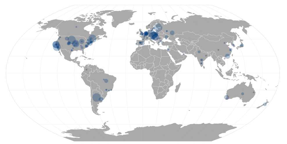
GitHub’s public timeline contains a wealth of knowledge about contributions to open source software from all over the world. It’s pretty typical to see over ten thousand contributions of some sort every hour! I decided to focus on the top 200 repositories (by forks) only in order to have a more manageable set of data. Each comment, pull request or commit is tied to a repository which in turn usually has a primary language associated with it. Contributions from folks who didn’t provide a location were ignored and OpenStreetMap’s Nominatim service was used to geocode locations into latitude and longitude for those who did say where they coding from.

If you aren’t from New York City or San Francisco and you contributed to a top 200 repository, you can probably find your own commits if you zoom in enough.

Contributions

Not all events are created equal. Watching a repository is not the same as committing code or opening issues. In general, I tried to calculate contributions based on the same criteria GitHub uses but I think I’m not introspecting commits and pull requests as deeply as they are. Typically, for larger repositories, users commit to their own forks — which I ignore — and later send pull requests which I’m counting. However, this discounts a large fork which merged many commits to be worth the same as a one line pull request. The person who actually merges the pull request gets the same credit as the author which actually makes sense when I gave it a second thought.

One way to improve my accounting of contributions would be to look at the actual repositories to see which commits to forks ended up in the “main line”. For a repository that actually uses GitHub virtually all commits end up in the main repository through pull requests or via somebody with permission to push directly which appear in the githubarchive.org data. For a repository like Linux which only stores code on GitHub and doesn’t accept pull requests it would be nice to actually analyze the commit history. I bet most of the Linux contributors have GitHub accounts to attribute their work to.

Geocoding

Geocoding messy data is well… messy. The location field for users on GitHub is simply a fill-in-the-blank field and users can type anything in there from their city to their university to an IRC channel. Sometimes people just type in a country name which is fine for Singapore but doesn’t really narrow it down too much for Canada. The locations listed for contributors on the top 200 repositories was surprisingly clean, however. It wasn’t without somewhat humorous errors though.

Links

Github Timeline and Social Coding


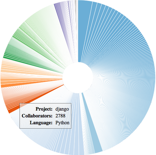
The Github public timeline is up on bigquery and I decided I’d play around with it. I created this visualization which is a first (alright, like eighth) try at measuring “how social” a project really is. The colors correspond to different programming languages and the size of the arc is based on the number of distinct collaborators on a project.

Other attempts

I thought about looking only at Pull Requests. It does uncover some interesting projects which have a lot of pull requests. I think this penalizes projects like Linux which doesn’t really have pull requests. Also, I wasn’t sure code submissions alone were exactly what I was looking for. I also briefly looked at only merged pull requests. I ended up filtering out projects with no stated language partially because there were a number of projects that just had common names (eg. “test).

While doing this, I figured I would have heard of the most social projects, but that there would be a lot of projects I’d never heard of for a variety of reasons. Some projects can get a lot of watchers, forks, comments or issues from an entirely separate group of people from the people I follow.

Most social projects by language

The visualization has the full dataset, but here’s a taste of the data:

  • C – php-src, linux, mruby
  • C++ – mosh, mysql, fr_public
  • JavaScript – bootstrap, meteor, jquery-file-upload
  • PHP – symfony, codeigniter, foundation
  • Python – django, legit, flask
  • Ruby – sample_app, rails, first_app

Sparklines in D3

A couple weeks ago, Protovis, a visualization library I’d been using was deprecated in favor of D3 and I thought I’d share some of the work I’d done porting visualizations from the old to the new.

One example that Protovis has for which there is no corresponding tutorial is sparklines. This sparkline shows the San Diego Padres’ first 100 games of the 2011 season. Up ticks are wins and down ticks are losses. Red ticks show shutouts. This is similar to the visualization in Tufte’s “Beautiful Evidence” p. 54.

I created another simple visualization for the National League West. This shows all five teams of the NL West on a single graphic. It is pretty easy to adapt this code to a single sparkline. So far I have been fairly pleased with D3’s performance and the ease of use.

Visualizing Data: Startup Edition


Lately, I’ve been working on visualization some security data we have at work. While I can’t share exactly what I’m doing, I thought I’d share a little of what I’m doing.

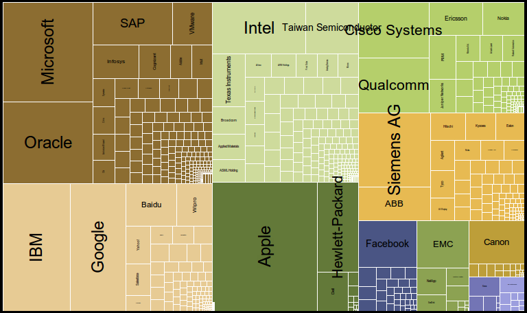
I created a treemap of technology company market capitalization data as of today using Protovis. The different colors correspond to different sub-sectors. The startup data is hazy as there’s no publicly available market and I did the best I could. My goal was to compare the size of these technology companies and see if I could see anything interesting. One interesting note is that Facebook is about as big as the combined rest of the startups. Google and IBM rule the services world. Apple rules the hardware world, but I’m not sure I’d classify them as a hardware company.

Regardless, enjoy!