Although I generally stick to Python, I am going to go off on a tangent about statistics, data sets and R. You’ve been warned.
Getting the data
Last week, the World Bank released some of its underlying data that it uses as development indicators. The data is fairly clean and easy to work with. I grabbed the USA data in Excel format and transposed it (using “paste special”) so that each year was a row instead of having the years as columns. Then I saved it as a CSV file on my desktop.
Working with the data in R
R is a programming language that focuses on statistics and data visualization. Unlike Python, R has a number of useful functions for statistics as built-ins to the language. These features allow you to easy find means, minimums, maximums, standard deviations, summarize data sets, plot graphs and more. Working with the data is very interesting and it provides a good way to learn R.
First off, you can read in the CSV file saved easily.
|
|
usa = read.csv('~/Desktop/worldbank_us.csv') |
The variable usa contains all columns of data and the columns can be accessed easily:
|
|
#show the population data usa$Population..total # Show urban population as a percentage of the total usa$Urban.population....of.total. # Show all available columns names(usa) # Summarize all the columns summary(usa) |
Plotting with R
Visualizing the data is the real interesting aspect and this is where R really shines. First we need to get the columns we want to graph.
|
|
year = usa$Indicator energy = as.integer(as.matrix(usa$Energy.use..kt.of.oil.equivalent.)) pop = as.integer(as.matrix(usa$Population..total)) energy_per_capita = energy/pop * 1000 |
There are some missing data points in both the population and energy use columns for the most recent years. It is possible that that data hasn’t yet been collected and verified. By coercing the data into an integer vector any non-integer data points will be converted into the R NA type. While similar to null or Python’s None, this type indicates that the data is not available and it will be ignored in plotting. Once the data is ready, it can be plotted easily.
|
|
# plot the data onto a graphical chart plot(year, energy_per_capita, xlab="Year", ylab="Energy Use (tons of oil per person)", main="US Energy Use", type="o", sub="http://data.worldbank.org", col="blue") |
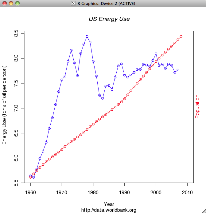
When I saw the resulting graph I thought to myself: WOW, that’s a lot of energy. I don’t think I use multiple tons of oil per year, but I assume this also includes industrial, commercial and military usage. Still, that’s a lot of energy. It’s interesting to note that the peak of US energy usage was 1978 and then there’s the subsequent decline due to the energy crisis. The next thing I thought about was how energy usage has leveled off while population has continued to grow. So I decided to put population on the same chart.
|
|
# allow a 2nd line on the same plot par(new=T) plot(year, pop, xlab="", ylab="", axes=F, type="o", col="red") mtext("Population", side=4, col="red") |

While the leveling of energy usage may not be as amazing as I thought due to the fact that a significant percentage of it must be industrial use which is probably declining, it is still interesting and fairly impressive. While the population has continued to grow fairly linearly, energy usage is flat or slightly less than it was 35 years ago. I guess those slightly more efficient water heaters and refrigerators are paying off.


